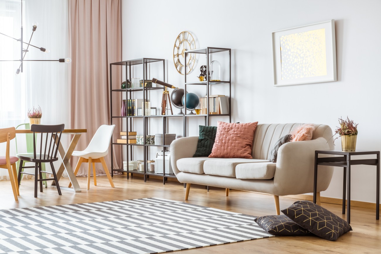
Half the battle of interior design is finding the right style and sized furniture to display inside your home. Once the furniture is delivered, you finally have to decide where to put it. This can be easier said than done, and there are common furniture arrangement mistakes you might be making that don’t utilize pieces to their greatest potential. Luckily, there are simple fixes you can try that will instantly transform any room in the house.
Small tweaks in your furniture layout can really elevate your home. Not only will your space end up feeling bigger and more aesthetically pleasing, but you’ll also end up with a layout that just makes more sense.
 Photographee.eu / Shutterstock
Here are six common mistakes you’re making with furniture arrangement.
1. Placing Furniture Against The Wall
You might think placing furniture right against the wall is the correct way to save space, but it can actually achieve the opposite effect. Doing this could leave you with a large and awkward space in the center of a room that you can’t really do anything with. Don’t be afraid to place furniture in the middle of the room and create small groupings of furniture.
Creating zones, especially in open concept spaces, will make the room feel more lively.¹ Have one corner of the room dedicated to a desk, another area with a cozy chair for a reading nook, and a main area around a focal point for conversing and watching television. If the space is smaller, place the desk directly behind the couch. You can meet more of your lifestyle needs by placing furniture strategically all over instead of stagnantly pushed against the wall.
2. Blocking Your Windows
Similar to how you don’t want to lean furniture against the wall, you also don’t want to place furniture directly in front of windows. This will block natural light from brightening up the room and eliminate dimension that makes a room feel larger.
If you’re lacking space and have no choice but to place something in front of the window, leave a small amount of space between the piece and the window. You could layer furniture and create a vignette with a small table within that space with a lamp on top.² That way, there’s a more artful effect and definitive purpose behind blocking the window.
3. Installing Low Curtains
Not every home comes with high ceilings. But you can create the illusion of high ceilings by playing around with your curtains. All you have to do is adjust the height. Instead of having the curtain rod sit at the top of the window, raise it higher towards the ceiling. Pair the rod with floor-length curtains and you’ll instantly make the room feel airier and taller.
4. Having More Than One Focal Point
A focal point is the part of a room that captures your attention.³ Whether it be a fireplace in the living room, bay windows in the bedroom, or a pop of wallpaper in the bathroom, it’s meant to be the thing your eyes land on when you enter the space. You should only have one focal point in a room to prevent it from looking cluttered.
For example, if a room has a fireplace and a show stopping piece of art, it would make sense to find another room for the art piece. Focus on smaller pieces of decor throughout the room instead to make it feel more balanced and sophisticated.
5. Ignoring Traffic Flow
A room might look perfectly arranged, but a layout can be immediately regrettable if it makes the space difficult to navigate. The cause might be tightly arranged furniture, having accessories that are easy to knock over, or only having a one-way path in and out of an area. Rooms should have a straightforward traffic pattern so people can comfortably come and go without trouble.
To fix this, try spacing out your furniture so it’s less crammed. Aim for at least 30 inches of space for walkways and remove any obstacles that are uncomfortable to walk past.⁴ That way, your guests can get up without interrupting conversation or a family member can sneak into the kitchen during a movie night without blocking the television.
6. Forgetting About Comfort
Placing your furniture to look like it belongs in Architectural Digest might seem desirable. But that perfectly centered coffee table and out-of-reach lamp might not be the most comfortable layout to live with. Strike a balance with your furniture arrangement that prioritizes both comfort and aesthetic. It’s your living space, and you should be able to throw your feet up on the coffee table or watch television from bed without a struggle.